A Word from the OpenSesame Development Team: February 2015


We’ve been off to a great start in 2015! There have been lots of exciting changes in our marketplace over the past month or so as we’ve rolled out a website redesign…if you haven’t already experienced them first hand on www.opensesame.com, you can do so now or read on for an overview of some of the new features.
Mobile Responsive Design
We have changed a lot about the site, beyond just the look and design of it; we’ve also changed some of the underlying structure so that it is now mobile responsive. What does that mean exactly? It means that our site automatically adapts to your device and environment. So, whether you are on a desktop, mobile, or tablet device, the display will automatically adjust the content and navigation to optimize the display for you. Ideally, this will minimize how much resizing and panning you’ll have to do on mobile devices to see all of the content.

Browse Courses Overlay
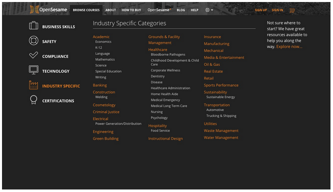
In the top navigation, we added a “Browse Courses” option that will give you quick browse access to easily scan through our entire marketplace’s categories of training, along with all of the sub-categories available in each topic area. This option is accessible from any page within the new design. In addition to providing a nice overview, it also links you right to the page with courses relevant to each topic for simple location of training courses.

Explore Pages
In addition to our existing search options, we’ve added a new way to review available training option. We have added an “Explore” system that will allow you to explore relevant content to a particular topic. In addition to including carousels of courses, we have also added Top Rated courses within a category, relevant sellers, staff picks, and blogs related to the category. Explore is a great option for folks who don’t know exactly what course or keyword to search for, but rather want to explore what options are available. Starting exploring now!

Course Pages
Even our individual course pages received a facelift. With the redesign on the course pages, we’ve made an effort to bring the most important information up to the top of page. We’ve also worked to make the information more easily scannable - from prices, ratings, system requirements, and other course description information. We’ve exposed more information around the course ratings and reviews, so that our customers have increased visibility about what others have thought about the course.
About Us
If you’re curious about the team behind the marketplace, our About page is the place to go! Here you can learn a little more about OpenSesame, what we do, why we do it, and the people that make it all happen. Scroll through the team in the new “Meet the Team” feature towards the bottom of the page. We love getting to know our customers, and we want you to get to know us!


