Effective Training Visuals—Abstract to Concrete


We’re back with the fourth in a series of blog posts written to help you evaluate elearning courses by considering how well their visuals add to the effectiveness of the training. The first in the series was about organizing elements within a visual to ease perception; the second was about directing the eyes of the viewer to key parts of the visual; and the third was about reducing realism and simplifying graphics. This time, we’ll focus on ways to make abstract ideas and concepts more concrete.
As we did in the three previous posts, we’ll provide guidelines drawn from the book Visual Language for Designers: Principles for Creating Graphics that People Understand by Connie Malamed. The visuals used as examples come from e-learning courses created by Convergence Training. As a side note, we’re happy to note that Malamed is currently writing a new book specific to training and visuals. Check out her blog to keep up to date on her progress, and consider reading it out when it’s available. A big hat tip to Connie Malamed.
Making the Abstract More Concrete
Malamed explains that this type of visual go by many names, including abstract, nonrepresentational, logical, and arbitrary graphics. But no matter what you call them, the artist is visually representing abstract ideas and concepts so they’re more concrete and therefore more easily understood by the viewer.
These techniques are used to represent ideas or relationships. They draw much of their explanatory power by representing ideas symbolically or by representing relationships through the visual space of the image, and they greatly aid the viewer by reducing complexity to a more simplified, readily apparent form.
Some ways to do this include providing the “big-picture” view, displaying data in visual form such as graphs and charts, creating visual displays of information, using maps and standard mapping conventions, and representing time visually. We’ll look at each below.
Give the Big-Picture View
One way to make a complex, multi-staged process or concept more readily apparent is to display a simplified version of it in a “big-picture” visual. These visuals make use of techniques such as visual hierarchies of information that give more importance to items at the top and left, cyclical representations, arrows, and global presentations. They allow the viewer to process the information at the larger, more universal level, and then to drill down into the smaller elements.
For example, the image below is from a course on evaporators. It gives the big-picture view of how an air conditioning systems works and how its smaller components each play a role.

The image below is another example. It presents a high-level overview of a somewhat-complicated, multi-step kraft pulping process used when making paper. This allows the learner to see all the different stages in the process, the different machines involved, and the order of operations.

Create Visual Displays of Data
Visual displays of date are some of the most commonly used abstract graphics, and we all see them every day in news stories, technical publications, and elsewhere. They include L-shaped graphs with an x- and y-axis, bar charts, pie charts, pictograms, statistical maps, area graphs, and more. All of these displays make great use of the visual space across which the information is displayed to convey meaning.
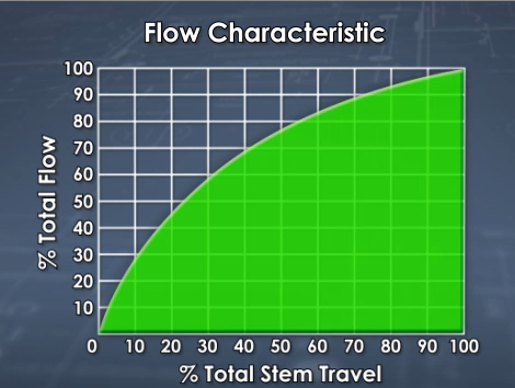
For example, below is an L-shaped graph that shows the “flow characteristic” of a valve, plotted as the percent of total flow through the valve against the distance the valve stem travels as it’s being opened or closed. In a quick glance, the learner can note the general convex-shaped curve to determine that this particular valve is a quick-open valve (as opposed to a straight line, which would indicate a linear flow valve, or a convex curve, which would represent an equal percentage flow valve).

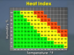
For a second example, consider the L-shaped graph below, which plots humidity and temperature to identify different heat indexes and uses colors to identify the most dangerous combinations (of course, the artist is making use of another visual convention in choosing green, yellow, and red to quickly communicate safe, caution, and danger/risk).

Present Information in a Visual Form
There are many highly inventive, clever, and unique methods used to visualize large sets of data and/or complex ideas. An example you’ve probably seen is a “word cloud” that shows you the words used on a given web page and how frequently each word appears (the words that are used more frequently are larger than the words used less frequently).
These “information visualizations” are less formulaic and more diverse than data displays, which tend to take the form of standard things like pie charts, L-shaped graphs, and pictograms, so it’s harder to give a simple explanation of what they are. For example, Malamed’s book includes a beautiful and fascinating image created by Stefanie Posavez of the United Kingdom that looks like a flower but is in fact a representation of the various chapters, paragraphs, sentences, and words in Jack Kerouac’s novel “On the Road,” with the words color-coded to represent major themes. (This is really worth checking out—I posted a picture of it onto my Facebook page and friends got really excited about it.)
In the example below, from a course on the H1N1 flu virus, we see a still image taken from a demonstration of how many Americans die as a result of flu each year, with each falling red cube representing a fatality (remember that this image, like all images in this post, is a still image captured from an animated video that plays out over time). The fatalities caused by the flu are compared to the number of fatalities caused by other things we may worry about more than the flu, such as bear attacks (represented by yellow blocks, so few they’re easily covered by the falling red blocks), shark attacks (green blocks, also now covered and hidden), and airplane crashes (blue blocks, with a few still visible). The overall effect is to quickly demonstrate to the viewer how few people die of bear attacks, shark attacks, and airplane crashes, and how deadly the flu truly is.

A second example is the image below, from a course on heat stress and an explanation of how being overweight can contribute to the risk of suffering heat stroke. The pulsing red zone within the person’s body is a quick and easy way to visualize an elevated internal body temperature and an increased risk of heat stroke.

Using Maps and Mapping Concepts
Another technique that Malamed discusses is the use of maps and mapping conventions to quickly convey information. Maps, like the graphs we’ve already discussed, are created using a set of conventions that most of us have already learned to read and interpret, making them a handy way to convey information. They’re abstract displays of information because they don’t (and can’t) include all information; instead they include only the information that’s most important to the map’s intended purpose. For example, consider the difference between a standard road map and a map that includes a state-by-state breakdown of American voting habits.
The map below is from the H1N1 flu virus course discussed earlier. The global map with multiple red ‘blotches’ was intended to simply demonstrate the global reach of the pandemic.

To consider another example, the map below from a course on corrugated board (lay people like you and me call this “cardboard”) gives a quick, easy-to-digest summary of the locations of corrugated plants in the Americas. Want a quick demonstration of how powerful this technique is? Just imagine how much more difficult it would be to quickly get the sense of the same infomration displayed in words and numbers within a table.

Represent Time Visually
The final technique to discuss is the visual representation of time. The classic example, and the one we’re all probably most familiar with, is the timeline, but there are other representations as well, and you often see time represented implicitly in visuals that explain sequences.
Let’s look at a timeline first. The image below is taken from a timeline that discusses key events in the history of papermaking (again, this is a still image taken from an animated video, so the image has been scrolling along the timeline from left to right). At this point in the video, we learn that in recent years there has been a greater emphasis on using recycled fibers to make paper.

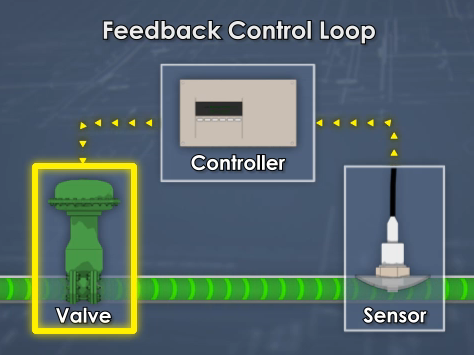
By contrast, the image below is a more implicit representation of time. It’s a description of a feedback control loop used to regulate a process. The viewer can see that material flows through a valve and then flows under the sensor (the curved arrows within the pipe represent flow direction and imply time). The viewer can also see that the sensor then sends a message to the controller, and that the controller then adjusts the valve accordingly (here, the pointed arrows that create a dotted line represent the direction of information flow and imply time).

That’s it for this installment! We hope we made what these visuals made these concepts about effective training visuals, which might have seemed abstract, more concrete (sorry, I couldn’t help myself there). Keep these tips in mind if you’re planning on buying some courses or if you’re getting ready to make some of your own—they should help you get better materials.
In the next post in this series, we’ll look at some tips for presenting complex information more clearly. Until then, have a good one.
One final note: While writing the sections above on data displays (graphs and charts) and maps, I couldn’t help but remember reading fantastic treatments of those concepts in the famous books about information design by Edward Tufte. If you’re especially excited about this stuff, his books are good to know about.
Jeff Dalto is an Instructional Designer and Trainer at Convergence Training. You can keep up with Jeff at the Convergence Training blog or on LinkedIn, Google+, Twitter, and Facebook.


