Performance Support with Mobile


It’s still really early for mobile learning. Many workers do own smartphones, but there are still plenty of employees who are less tech savvy and struggle with mobile technology.
While mobile learning is in its infancy, there is no shortage of great mobile applications out there that we can learn from. Like many in the learning and development world, I’m always looking for inspiration in day to day life. In my after-work hours, I’m in training to become a Pilates instructor, and one of the most important tools in my development has been the Pilates Interactive app.
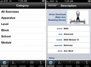
This is one of the best-designed information apps I’ve discovered - they take quick reference information on more than a thousand different exercises and organize it in a simple way that helps me become a more effective practitioner and instructor. So what’s so great about this app?
The Characteristics of a Great Mobile App for Learning
- Great data hierarchy. This app has great data trees where I can look at groups of exercises by a number of different characteristics - the muscle group targeted, the apparatus used, the difficulty. I can slice and dice all of the content however I like.
- Simple interface. Everything is concise, there’s lots of white space and no extra steps in between different operations. I can get to what I need, instantly.
- Concise but complete information. For each exercise, I get step by step instructions, tips for explaining the exercise to clients and a short video with a master instructor performing the exercise.
- Variable video quantity. If I’m on a wireless network, the app uses higher quality video. If I’m on 4G, they downgrade the video quality slightly so that it streams more smoothly.
What can we learn from this and other excellent apps out there?
First, let’s think about the context in which most learners are accessing mobile content. They’re in the flow of work and they need help or reference material. They want to review or refresh their memories or correct a mistake. They need to get exactly the information they need without being trapped in a specific process or workflow. This is a time where chunking content is really essential – you want people to be able to find the exact snippet of information that will support their performance in that minute. The Pilates Interactive app is designed to help me get exactly to what I need, instantly.
Second, it’s better to create content designed for mobile devices rather than just redeploying content you made for a desktop environment. Not only the visual presentation of the information matters – but the chunking and organization of information should be even more succinct and efficient for the mobile environment than you would deploy in a desktop context.
Third, and needless to say, phone and tablet screens are small. Every design should allow for big, poky fingers and people who might use reading glasses. This means no small print, no tiny buttons, and make sure learners can always access the menu. Mobile content must be really simple and intuitive to use.
Finally, before deciding to develop content specifically for mobile, take a moment to make sure that it makes sense for your audience right now. Is your audience tech savvy? Are they truly a mobile audience? Are they comfortable with self-directed exploration of information? Make sure the mobile content form fits their needs and abilities at this stage.
What great mobile app designs do you admire? Have you experimented with mobile design? Tell us in the comments.


