Effective Training Visuals—Reduce Realism


This is the third in a series of blog posts intended to help you evaluate elearning courses by considering the effectiveness of the visuals they include. The first in the series was about organizing elements within a visual to ease perception. The second was about directing the eyes of the viewer to key parts of the visual. This time, we’ll focus on something that may seem counter-intuitive: reducing realism.
As we did in the two previous posts, we’re going to provide visual examples of guidelines drawn from the book Visual Language for Designers: Principles for Creating Graphics that People Understand by Connie Malamed. The visuals come from elearning courses created by Convergence Training. As a side note, we’re happy to note that Connie Malamed is currently writing a second book that’s even more focused on creating visuals for training content. Check out her blog to keep up to date on her progress with that one, and definitely give it a read when it’s available.
Reducing Realism in Training Visuals
In her book, Malamed discusses the importance of reducing the realism of an image in order to increase comprehension and retention. Simpler, less-realistic visuals allow the viewer to scan them more quickly, move the information into long-term memory more readily, and reduce the chances of overloading the viewer’s short-term (or working) memory, which can store only very few bits of information at any one time.
Malamed also notes that simplified, less-realistic graphics are especially useful for learners who are new to a topic, whereas people who are more familiar may benefit more from visuals with higher degrees of realism.
Some ways to reduce realism in an image are reducing or removing visual noise, using silhouettes, using icon forms, using line art, and limiting the quantity of objects in a visual. We’ll look at each below.
Removing Visual Noise
Visual noise is the collection of details within the image that may make it appear more realistic but can also distract the viewer’s eyes and attention from the really important information. Reducing visual noise within an image makes it easier for the viewer to focus on the essential stuff.
For example, this image is from a course on conveyors and comes up during an explanation of different types of conveyors. As the audio discusses roller conveyors with materials rolling on top of the conveyor’s belt, everything in the visual disappears except for the conveyor belt and the item on top. This makes it easier for the viewer to immediately focus on the key concept, and doesn’t distract the viewer with other parts of the conveyor or with a potentially busy and distracting factory scene.

Or, consider the example below, taken from a course on crane safety. The audio is discussing the importance of inspecting the hooks before they are used. So, the visual displays just the hook, and the crane and the industrial setting are removed from view.

Using Silhouettes
Another way to reduce the realism of an image is to make use of silhouettes.
Artists can use silhouettes to represent things using merely their shape. Using a silhouette to represent a person or an object can help your viewer quickly identify the object and understand what it is. In addition, in some cases a silhouetted object can represent all objects of that type—for example, a silhouette of a man may represent all men, and a silhouette of a woman may represent all women.
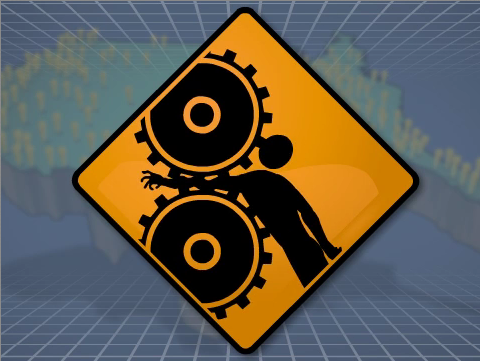
Consider the image below, taken from a course on machine guarding. The audio is discussing the importance of using machine guarding to prevent common injuries, such as the crushing of a body part. The silhouetted human figure, gears, and mangled arm convey this hazard effectively.

Want another example? We need look no further than the same course on machine guarding and its list of common machine-related injuries. This time, the blackened silhouettes make the risk of amputation immediately apparent.

Using Icons
Icons are simplified, stylized representations of real-world objects or ideas. Unlike a silhouette, which uses only shape, icons may use shape, line, and color. Like silhouettes, however, they allow the viewer to quickly identify the object and move the information into long-term memory.
For example, the visual below is drawn from a course on process control charts. The audio is discussing the importance of product consistency. The large, red X quickly conveys to the viewer that this product is not consistent with productions standards.
![]()
Another example appears only seconds later in the same course. This time, a green checkmark indicates a product that is consistent with production standards.
![]()
Incorporating Line Art
Line art uses simple lines to represent the outline of a person or item. And like silhouettes and icons, line art can make it easier to quickly identify an object and process the key information. Malamed also mentions that line art can be especially useful for technical drawings that explain the inner workings of the body or a machine.
Below is a good example from a course on the evaporators used in the papermaking process. As the audio discusses three different common evaporator designs, line drawings of each are presented, making it easy for the viewer.

Our second example below is taken from a course on tanker rollovers. While discussing the importance of checking road and traffic conditions along a route before setting out, the visual uses simple line drawings to represents roads (note: this also makes use of the convention of mapping, which will be discussed in a later post in this series).

Limiting The Quantity of Items in the Visual
Malamed’s final tip for reducing realism is to reduce the number of objects in the visual. This may mean removing unrelated items, a technique we’ve already seen several times in earlier examples of other techniques. Or it may mean using one or two items to represent many more.
For example, check out the image below from a course on cranes. During a discussion of crane rigging and slings, the audio discusses different types of rigging devices. While discussing spreader beams, the image below appears. Everything else you’d see in a photo of a spreader beams on a real crane in an industrial work area has been removed, making it easy to recognize what a spreader beam is. In addition, this one image of a spreader beam represents all spreader beams (for those of you who studied philosophy in college, this isn’t so far from the idea of the “Platonic idea” of a chair—see, you DID finally get to use that in real life!).

Finally, consider the image below. It’s taken from a course that explains a somewhat-complicated part of the papermaking process. As the audio explains what happens to many wood chips surrounded by cooking liquor within a Kamyr digester, a visual call-out displays a single wood chip that represents all of the chips in the column (note: the call-out technique is something we’ll revisit in a later post in this series).

That’s it for this installment! We hope you found this helpful and maybe even a little fun. Keep these tips in mind if you’re planning on buying some courses or if you’re getting ready to make some of your own—they should help you get better materials.
In the next post in this series, we’ll look at the importance of making abstract concepts more concrete. Stay tuned.
Jeff Dalto is an Instructional Designer and Trainer at Convergence Training. You can keep up with Jeff at the Convergence Training blog or on LinkedIn, Google+, Twitter, and Facebook.


