Effective Training Visuals—Directing the Eyes


This is the second in a series of blog posts intended to help you evaluate elearning courses by considering the effectiveness of the visuals they include. The first in the series was about organizing elements within a visual to ease perception. This time, we’ll “focus” on directing the eyes of viewers to particular elements on the screen (sorry, bad joke—I couldn’t stop myself).
As before, we’re going to provide visual examples of guidelines drawn from the book Visual Language for Designers: Principles for Creating Graphics that People Understand by Connie Malamed. The visuals come from elearning courses created by Convergence Training. As a side note, we’re happy to say we have learned that Connie Malamed is currently writing a second book that’s even more focused on creating visuals for training content. Check out her blog to keep up to date on her progress with that one, and definitely give it a read when it’s available.
Use Screen Elements to Direct the Learner’s Eyes
One way designers can use visuals so they increase the effectiveness of training materials is to direct the eyes of the learners to the important parts of the screen or, as Malamed says in her book, “through the structure of the graphic.”
Five ways to do that are to use position, emphasis, movement, eye gaze, and visual cues. We’ll look at each below.
Position
A designer can use the boundaries of the visual to create a “frame,” and then place visual elements within that frame in a manner that guides the learner’s eyes through a sequence and/or gives hints about what is the most important element on screen.
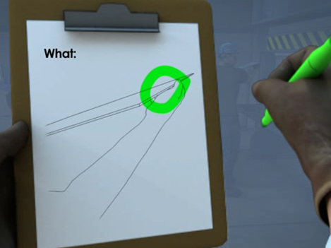
For example, the image below from a course that explains how to perform a job hazards analysis takes advantage of the eye’s natural tendency to read from top to bottom and left to right to create a “visual hierarchy” of information. In the top left, we learn we’re analyzing the “What?” of the JHA’s four-step “Where?/What?/How?/Consequences” sequence, and as our eyes scan to the right, we see that the sharp blade is an example of the “What?” that defines the hazard.
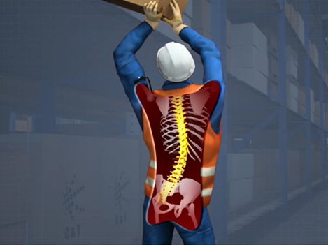
Now let’s look at a second example, taken from a course on ergonomics. The worker’s spine is located directly in the center of the image, making it easy for the learner to focus on the risks of working in awkward postures.
Emphasis
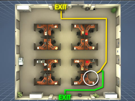
Another way to direct the viewer’s attention is by using emphasis. Malamed notes that the artist can do this by varying size, tone, color, texture, shape, and more. The eye is naturally attracted to border areas where things contrast.
For example, this image from a course about emergency action plans uses the contrasting colors of yellow and green while discussing the importance of knowing the best way to evacuate your work area in the event of an emergency.
Or, in this example, taken from a course on fall prevention and protection, the red color of the scaffolding creates contrast with the blue background of the glass building, immediately directing the learner’s eyes and attention to the scaffold and its position “at height.”

Movement
Yet another way to direct the viewer’s attention is through the use of “movement” in the image. This doesn’t necessarily mean you have to use animation (though that can be useful), but that the image conveys a sense of movement. This can be done with repetition, lines, curves, three-dimensional depth, and more.
For example, this image from a course on chemical process safety management arranges the different elements in a job process within a straight line to help demonstrate their sequence within the process and the concept of a process in general.

In our second example, taken from a course on line breaking, the use of three-dimensional representation helps to make it clear that the pipe in the foreground is where attention should be focused.

Eye Gaze
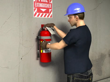
Another trick of the trade is to use eyes within the image to direct the attention of the viewer’s eyes. Specifically, a designer can draw attention directly to an eye (or eyes) within the image, or direct attention in the direction that a person within the image is looking.
For example, this image from a course on first aid at the work place uses the man’s eyes to direct the viewer’s attention to his hand, where an amputation injury has occurred.

Or, in this example, taken from a course on fire safety, the man’s eyes help to direct our attention to the fire extinguisher on the wall.
Visual Clues
The last method for directing the viewer’s eyes—and their attention—is to use visual clues. This may include arrows, color, highlights, and captions.
For example, this image from a course on valves uses a line, color, and caption to help explain which part of a valve is the bonnet.

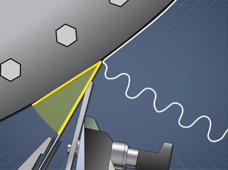
Or, in this example, taken from a course that explains how doctor blades work in the process of making paper, the yellow lines below draw the viewer’s attention to the angle between a large drum and the doctor blade (this angle affects the amount that the paper coming off the drum is “crumpled,” more correctly known as creping).
That’s it for this installment! We hope you found this helpful and maybe even a little fun.
Keep these tips in mind if you’re planning on buying some courses or if you’re getting ready to make some of your own—they should help you get better materials.
In the next post in this series, we’ll look at the importance of reducing realism, which may seem counterintuitive to some of you. Stay tuned.
Jeff Dalto is an Instructional Designer and Trainer at Convergence Training. You can keep up with Jeff at the Convergence Training blog or on LinkedIn, Google+, Twitter, and Facebook.


