How to Make eLearning Course Text Look Great


I see many elearning courses over a year, some published by market-leading elearning agencies. What saddens me is a widespread lack of understanding of how to present text on a screen.
If content looks heavy, readers get the subconscious impression that the material is difficult; this only adds to any apprehension they may initially have with your course. It can knock their confidence and may lead to a lower completion rate.
Over the last 15 years I have trained thousands of people for the screen. So here are some tips you may like to run through, and perhaps even add them to your content writing guidelines.
Paragraphs
The opening paragraph on a screen should ideally sum up the content below and draw the reader in. It shouldn't be longer than 30 words. All of the subsequent paragraphs should be no longer than five lines in depth. Okay, one or two can be longer, but then there should be some shorter than five. Don't follow a principle you might have learned at school: one idea equals one paragraph. Feel free to break up paragraphs into smaller ones.
Line Width
Lines should ideally be displayed 8 - 10 words wide. Wide text and narrow text reduce readability. Too much text displayed poorly will result in the reader abandoning it.
Sentences and Words
Sentences should be short and no longer than 15 words. eLearning especially needs even shorter sentences than this. Word length should average five characters. You can check this with Microsoft Word using the readability statistics dialogue box (more about this shortly). Sentences and paragraphs need to vary in length. The eye rejects boring repetition.
The Visual Edit
There needs to be a final pass after proof reading, this is when you check all of the above and fine-tune the paragraphs to make the text look good.
There is a very easy way to ensure you get word and sentence lengths correct. This is done by running a spelling and grammar check and viewing the readability dialogue box. This can be done in Microsoft Word (to switch this on, go to Word’s help menu).
To check your text, select the area of text you want to check, then run a spelling and grammar check. Once you have completed this, perhaps ignoring some spurious suggestions it presents, a dialogue box will pop up. Look for Flesch Reading Ease Score. It needs to be around or over 60. Technical text with lengthy words will conspire to lower this, but by careful wording even the trickiest text can be improved. Word length: this needs to be less than an average of five characters.
Long Words
You need to avoid 'nominalisations,' also known as 'hidden verbs.' For example 'the advancement of science' should be rewritten as 'science has advanced.' This is switching to a verb from a noun. This shortens the words used and makes the text appear less ponderous. Look out especially for nouns with -tion, -ment, -ing, and -ibility endings. The simpler and shorter the words, the clearer the text.
eLearning screens typically carry less words than a web page, especially as some courses are now being adapted for readers using mobile devices. So our writing challenge is even greater than for the web.

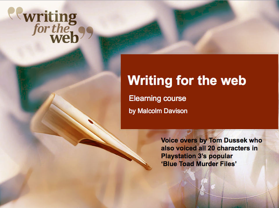
In this blog I have only included my ‘top tips.’ If you want to learn more and perhaps have some practice writing for screens you may like to take my writing for the web course hosted by OpenSesame.
Malcolm Davison has trained some 4,000 staff from most of the UK’s major financial service companies and government departments. In total, he has worked in eight mainland European countries including Belgium for the European Commission and offices of the UN in three countries.


